Catch up on my weekly ORC posts here:
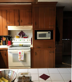
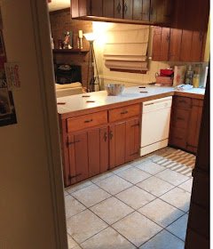
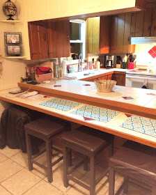
This One Room Challenge has been a bit of a bear, with all of our ambitious goals and old house challenges, but it is all worth it! To refresh your memory, here is what our kitchen looked like when we started...orangery cabinets from the 70's and burgundy accent tile from the 90's.
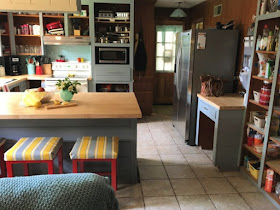
Now on to the best part...the REVEAL of our new and improved Mid Century Modern Kitchen!
(Spoiler Alert...We did not finish the cabinet doors because my husband built new ones and we just ran out of time, but check back because I will update this post once we finish)
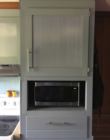
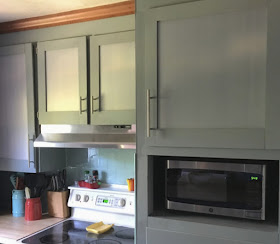
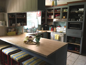
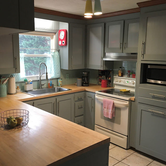
The wood cabinets had good bones so we kept them and decided to just update the doors. To save money, my husband decided he would make them instead of purchasing new doors. The new doors are shaker style with a frosted insert in the upper cabinets.
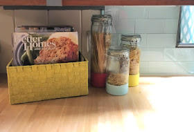
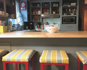
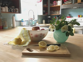
The biggest expense and biggest change in the kitchen is the custom butcher block counters we installed! It makes the room so much brighter and cleaner.
Can we also talk about the back splash? I can't stop staring! The Aspect Peel & Stick glass tiles in Morning Dew add a little bit of glam to the kitchen. We went with the classic subway pattern to keep the lines clean. I will have a tutorial up soon for installing the tiles, so make sure you subscribe to my email list before you go!
We replaced the bronze strap hinges and hardware with modern pulls and hinges in brushed nickel. We went with two sizes from D.L. Lawless Hardware, a 3" pull for the drawers and small cabinet doors and a 9" pull for the larger cabinet doors and pantry doors.
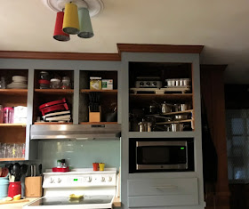
We replaced the range hood, microwave, fridge, and sink with stainless steel. For now, our oven will stay because it works, but eventually we will replace it as well. We went with a counter depth fridge to give us a little more room at the entry, since it is a tight fit between the entry door and cabinets and it really makes a difference!
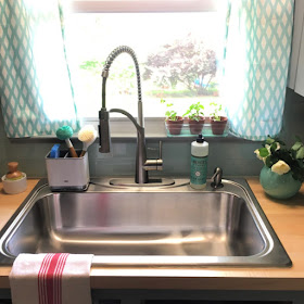
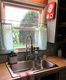
Speaking of the sink, we went with Sterling by Kohler's single-bowl, top-mount style which has a modern feel. We also replaced the faucet with a commercial style single-handle pull down faucet by Glacier Bay. My husband picked it out and at first, I was not sure if I would like it, but it really adds a funky modern look to the kitchen!
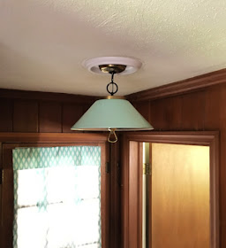
Lastly, we replaced the hideous "boob" lights with funky MCM fixtures. My husband DIYed the tri-color light using mini metal buckets that I painted. We found the one in the entry way at a thrift store recently and I painted it light teal to match the tile.
Even though we are not quite finished, we are already enjoying our new kitchen and will be showing it off this weekend when we host Mother's Day lunch!
Special thanks to my sponsors:
Aspect Tile, D. Lawless Hardware, and Rust-Oleum, for providing products used to achieve this fabulous transformation!
Here were the projects we completed in the MCM Kitchen:
- Replaced tile counter top with butcher block and extended bar height counter
- Replaced tile back splash with Aspect Morning Dew glass peel and stick subway tiles
- Painted cabinets and pantry
- Replaced handles and hinges (with D. Lawless Hardware)
- Replaced roman shade on door and made café curtains for the kitchen window
- Painted and recovered bar stools
- Replaced sink/faucet
- Replaced both ceiling lights
- Replaced range hood, microwave, and fridge
- Built new cabinet doors with frosted ribbed plastic inserts
UPDATED photos with completed cabinet doors (1/2022)
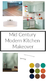
Here was my inspiration board for what I wanted to accomplish, and I think I came pretty close! What do you think?













Such a great transformation! You guys worked hard, and it shows! Congrats!
ReplyDeleteThank you! I wish we would have got the doors up, but life.... It will be finished soon though!
DeleteSo excited for you, Mary! What a fabulous new kitchen. Yall did a great job. Super congrats.
ReplyDeleteIt does not seem like the same space! I love it so much!
DeleteYou did such a great job! I love the painted light fixtures. Such a cool touch!
ReplyDeleteThank you! I used so much spray paint in this kitchen project!
DeleteSuch an awesome transformation! Love the butcher block. I’d love to do that in my kitchen! <3 Jamie
ReplyDeleteThank you! I am so glad we did it! It really warms up the space!
DeleteI love the custom butcher block you guys installed in the kitchen. Love the new paint color & I can't wait to see the cabinets installed. So impressive that your husband built new ones! Great job, Mary!
ReplyDeleteThank you! We really love how it has turned out so far and my husband did an outstanding job on the doors for his first time! I can't wait to show you!
DeleteMary! I love how your kitchen turned out. The butcher block is amazing and those light fixtures you DIY'd very cool. I have loved following along. xx
ReplyDeleteThank you for your encouragement and kind comments! I am proud of what we accomplished!
DeleteThe counter tops look so, so good! The lights are a really fun touch to the space. I love it.
ReplyDeleteThank you so much! We love the countertops and how it turned out!
DeleteMy wife works like John Henry - I'm blessed!
ReplyDeleteMy husband is too kind :-)
DeleteI love the color scheme that you chose. This is an awesome remodel!
ReplyDeleteThank you! I am really proud of it and it looks like a whole new kitchen!
Delete